You found the perfect print, the perfect photo, or the perfect piece of art. Now comes the part everyone underestimates: getting a frame that actually does it justice. Building picture frames sounds simple until you’re staring at fifteen moulding options wondering why your living room still looks unfinished.
How Do You Build a Picture Frame the Right Way?
Building a picture frame the right way means matching the moulding style, matting, and glazing to your artwork’s size, weight, and lighting environment. The frame should complement the piece, not compete with it. Choosing quality corners, proper spacing, and UV-protective glass ensures your art stays protected and looks intentional for years, not just assembled.
Frames aren’t just borders. They’re the difference between a piece that looks like it belongs and one that looks like an afterthought. Getting this right takes a bit of know-how, but you don’t have to become a woodworking expert to get it done.
Why Frame Selection Matters More Than You Think
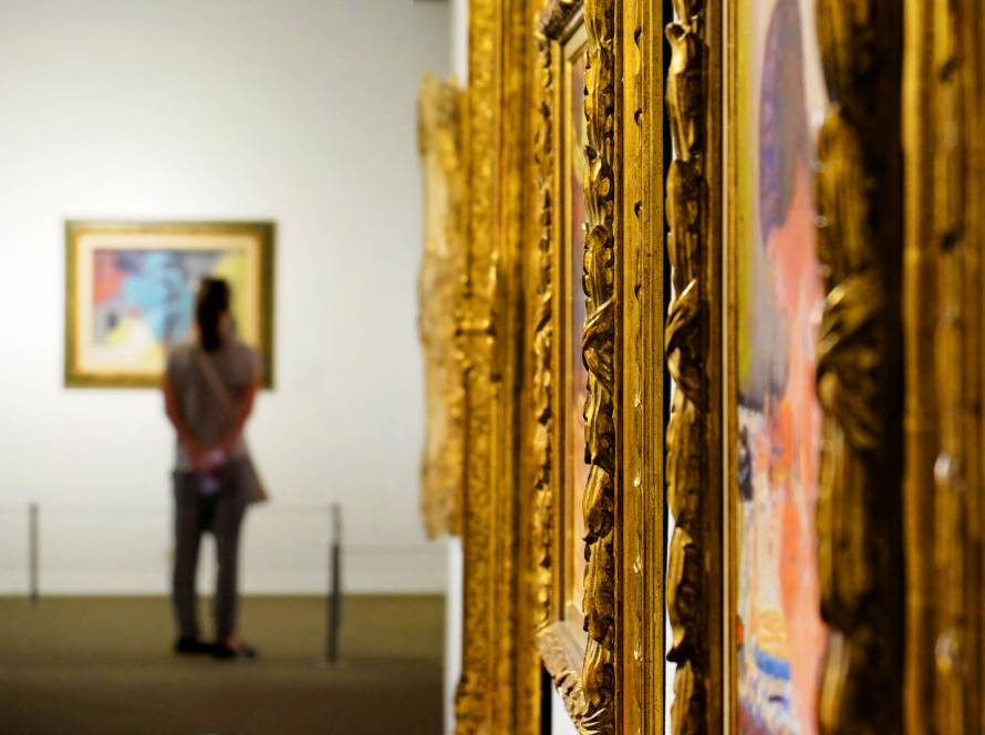
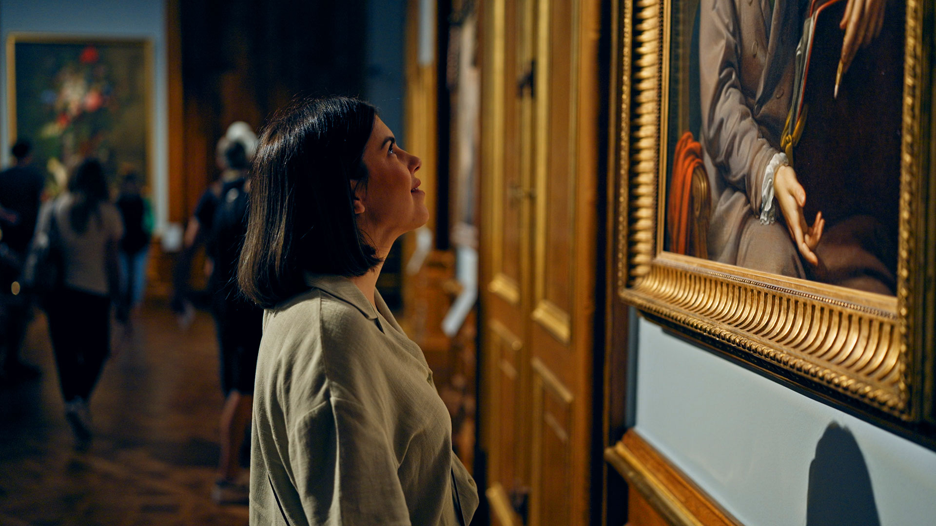
A frame does three jobs at once: it protects the artwork, it directs the eye, and it ties the piece into the room. Skip any one of those, and the whole presentation feels off.
- Protection: glazing and backing keep dust, moisture, and UV rays away from delicate paper or canvas.
- Focus: the right width and color pull attention to the art, not the frame itself.
- Cohesion: matching tones and finishes make the piece feel like it was designed for that wall.
Get any one of these wrong, and even a gorgeous print can look flat or mismatched.
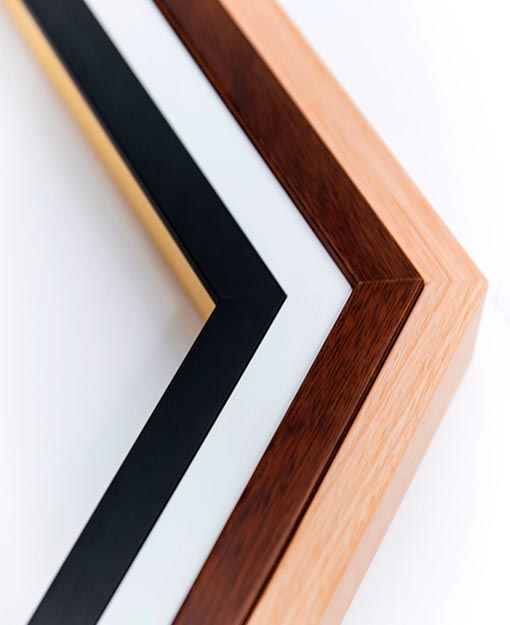
Matching Moulding to the Artwork
Bold, colorful pieces usually pair well with slim, understated frames. Delicate watercolors or black-and-white photography often benefit from wider mats and softer wood tones. The goal is balance: nothing should shout louder than the art itself. Consider the room too. A rustic wood frame feels out of place in a sleek, modern space, while a thin metallic frame can feel cold in a warm, traditional room.
Choosing the Right Glass or Acrylic
Not all glazing is created equal. UV-filtering glass or acrylic protects against fading, especially for pieces hanging in sunlit rooms. Non-glare options are worth considering for spaces with heavy overhead lighting or windows facing the frame directly.
Common Mistakes People Make With Framing
Even experienced collectors slip up here. A few recurring issues show up again and again:
- Choosing a frame that’s too thick or too thin for the piece’s scale.
- Skipping mat spacing, which makes artwork feel cramped against the frame edge.
- Ignoring UV protection, leading to faded colors within a year or two.
- Mismatching finishes, like pairing a warm-toned print with a cool silver frame.
These small missteps add up fast, and they’re the reason so many framed pieces end up looking off despite great artwork.
When It Makes Sense to Get Help
Some people love the hands-on process and want to learn every step themselves. If that’s you, there’s a full breakdown on picture frame techniques worth exploring. But for most people, especially with valuable art, awkward sizes, or time constraints, working with a framing specialist saves headaches. Professionals catch sizing issues, spacing problems, and glazing needs that are easy to overlook when you’re doing it solo.
What to Look for in a Framing Service
- Custom sizing for odd dimensions or oversized prints.
- Material variety, including wood, metal, and mixed finishes.
- Conservation-grade options for valuable or sentimental pieces.
- Design guidance to match your space and style.
A good framing partner treats your piece like it matters, because it does.
Bringing It All Together
The right frame elevates artwork instead of just containing it. From moulding choice to glazing type, every decision shapes how the final piece feels on your wall. Whether you explore the craft yourself or lean on expert guidance, understanding these fundamentals helps you make smarter, more confident choices for your space.
Frequently Asked Questions
What size mat should I use for a standard print?
A 2 to 3 inch mat border works well for most prints, giving the art breathing room without overwhelming it.
Does frame color really affect how art looks?
Yes. Warm frames enhance earthy tones, while cool-toned frames complement blues, grays, and modern palettes.
Is UV-protective glass necessary for all artwork?
It’s especially important for pieces in sunlit rooms or with delicate pigments, since UV exposure accelerates fading.
Can one frame style work in multiple rooms?
Simple, neutral frames tend to transition well between spaces, while bold or textured frames are more room-specific.